 Translate

Overview
Report designer's default look:
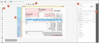
- Main toolbar - contains basic commands, like save/open reports and formatting buttons to change appearance of the currently selected element.
- Print preview button - allows to quickly switch to preview mode and see how your template will be looking using real data from the database.
- Toolbox panel - contains elements which can be placed on the design surface.
- Design surface - here you build template structure, using bands and controls from the toolbox, which are bound to database fields listed in the field list.
- Field list - contains list of database fields which you can use in your template. Please read separate article about navigation in the field list.
- Property grid - contains properties of the selected element. Most properties will be never used, while others will be interesting.
The Toolbox contains all available report controls and allows end-users to add them to the report being edited. Report controls can display both static and dynamic information of different kinds (simple or formatted text, pictures, tables, etc.) and adjust a report layout (organize controls within panels, insert page brakes, etc.)
General Content
The following controls are most commonly used to display data in a report.
|
Icon |
Control |
Description |
|---|---|---|
 |
Label |
The most basic Label control is intended to display plain text in a report. |
 |
Check Box |
The Check Box control displays True/False or Checked/Unchecked/Indeterminate states in a report by displaying (or not) a check mark, which can be accompanied by a text description. |
 |
Rich Text |
The Rich Text control displays formatted text in a report. |
 |
Picture Box |
The Picture Box displays static or dynamic images of various file formats in a report. |
 |
Table |
The Table control is designed to display tabular information in a report. |
 |
Bar Code |
The Bar Code control transforms its content into a bar code of the specified type. |
 |
Zip Code |
The Zip Code control transforms its content into a zip code. |
 |
Gauge |
The Gauge control provides the capability to embed graphical gauges into a report. |
Extended Data
The following controls are connected to data individually, without accessing a report's data source.
| Icon | Control | Description |
|---|---|---|
 |
Chart |
The Chart control displays a series of points using numerous 2D or 3D chart types. |
 |
Sparkline |
The Sparkline control displays a compact chart that is commonly used to reflect the flow of data for every row in a report. |
 |
Pivot Grid |
The Pivot Grid control displays dynamic data in a cross-tabulated form. |
Report Layout
The following controls allow you to draw shapes in a report and customize the report layout.
| Icon | Control | Description |
|---|---|---|
 |
Panel |
The Panel control is a container that frames separate report controls to allow them to be easily moved, copied and pasted, and visually unite them in the report's preview. |
 |
Line |
The Line control draws a line of a specified direction, style, width and color. |
 |
Shape |
The Shape control draws one of the predefined graphic objects (rectangle, ellipse, etc.) |
 |
Subreport |
The Subreport control allows you to include other reports in a current report. |
 |
Page Break |
The Page Break control inserts a page delimiter at any point within a report. |
 |
Cross-Band Line |
The Cross-band Line control draws a line through several bands. |
 |
Cross-Band Box |
The Cross-band Box control draws a rectangle through several bands. |
Document Statistics
The dynamic content of the following controls is not obtained from a data source.
| Icon | Control | Description |
|---|---|---|
 |
Page Info |
The Page Info control is intended to add page numbers and system information (the current date and time or the current user name) to a report. |
Adding controls to a report
To add a control from the Toolbox to a report, do one of the following.
- Double-click an item in the Toolbox to create the corresponding control at the default position.
- Drag-and-drop an item from the Toolbox onto the required position within a report.
- Select an item in the Toolbox, and then indicate the bounding rectangle by holding down the left mouse button.
- If you need to perform selection, re-arranging or resizing operations, select an element with mouse pointer.
- To edit properties of the selected element, select single element and find properties panel. You can use search box to find necessary property.
- To edit the text inside label or text control, simply double click on it. In the case of rich text, you can apply different formatting into different parts of the text inside it.
- To do this select the text and change any formatting parameters (font, color, alignment) - these commands will be applied only to the currently selected text.
The Field List panel is intended to display the structure of the data source to which a report is currently bound.
When you are working on the invoice template, usually field list contains 1 source (or table): Invoice. This source links report with a corresponding table in Trados Business Manager database.
You may add as many source as you need to build your template. As an example, let's take CV template: some built-in CV templates contains 2 data sources: User and Projects. First one serves as a source of user's data, while second one is used to show list of your recent projects.
Filed list is used to create new bound report controls, manage calculated fields and template parameters.

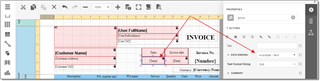
To add any field to the report, drag and drop a field from the field list to the design surface. This creates an appropriate control bound to the selected data field.
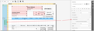
To find out which database filed a control is bound to, select this control, and find Data binding property:
Grouping data
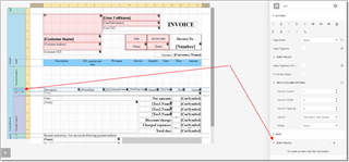
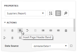
To group a band and insert group header and group footer bands, select a band and find Insert header band and Insert footer band buttons on the properties panel:
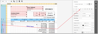
Then, select an inserted group header and find Group fields property:
The Group and Sort Panel allows to quickly apply grouping and sorting to report data.
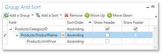
Grouping allows to create logical groups by some fields, to calculate for example some summaries by groups, or insert some common information for your groups. For example, when you print an invoice, you can create a group by Job ID, to display some common information about a job in a group footer, and for example show some total from a group (number of tasks in a job, or total amount of words).
Sorting data
Sorting allows to specify rules of data sorting inside a detail band or group band.
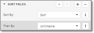
To specify sorting conditions, select detail band and find Sort fields property:
Here, you can add necessary sorting fields, select sorting direction, etc. For example:
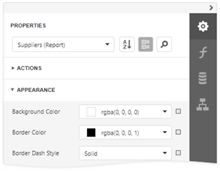
Properties panel
The Properties panel allows you to access and customize settings of a report and its elements.
Selecting a Report Element
To select an element and show its properties in the Properties panel, do one of the following.
- Select a required element in the drop-down list at the top of the Properties panel.
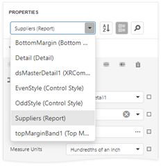
- Select a required element in the Report Designer Surface.
- Select an element in the Report Explorer and click Edit button.
Switch Between Display Modes
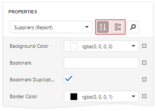
Element settings are displayed in alphabetical order or in categories. Use the buttons next to the selected element to switch between display modes.
Changing Property Values
Each property record consists of a caption, a value editor, and an optional property marker. To change a property value, select the property and specify its value in the editor.
Certain properties contain nested properties which can be accessed when you click the header.
The property marker indicates whether the property value was changed:
-
If a property stores a default value, its property marker is gray.
-
If a property value was changed, the property marker becomes white.
-
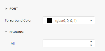
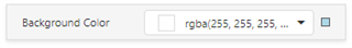
If a report style overrides a property value, the marker is light blue. This applies to appearance properties (for instance, an element's BackColor, Font, Borders).
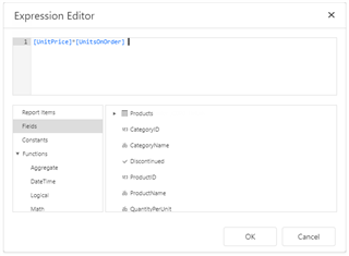
Specify Expressions
The Properties panel allows you to specify expressions that can include two or more data fields and functions. Click a property marker to see whether the invoked context menu has the "PropertyName" Expression item.
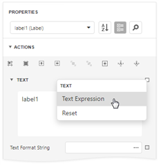
Click this item to specify an expression in the invoked Expression Editor.
The Properties panel highlights properties that have an assigned expression.
Search for Properties
Click the  button to show the search box. When you type in the search box, the Properties panel filters the list of available properties and highlights the search string in the property record.
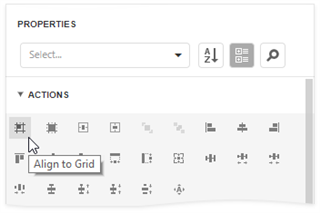
Use Actions
In the categorized mode, the Properties panel contains the context-sensitive Actions group that provides the most commonly used actions for the selected report element:
-
Add new bands, if you selected a report.
-
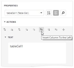
Manage a table element's cells, rows, and columns.
-
Align and position report elements (for instance, align and resize elements to the snap grid, specify horizontal and vertical alignments) for individual and multiple selected report elements.