

Idea Delivered Partially

This has been partially delivered through support for Windows 11's high-contrast themes in the latest Trados Studio 2026 Release, initially as a beta feature. See Trados Studio 2026 Release is here! for more information.

More color schemes for Studio and MultiTerm

The color scheme currently available for Studio/MultiTerm 2019 (and 2017) is limited to White, Light Gray and Dark Gray.

These three colours are within the same range so it makes it difficult to differentiate interfaces at a glance, for instance if one has both Studio 2019 and Studio 2017 open at the same time (even with different colours for each interface).

Below is a screenshot showing Studio 2021 (Beta) in White, Studio 2019 in Light Gray and Studio 2017 in Dark Gray:
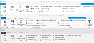
Screenshot of Trados Studio 2021 Beta interface in white color scheme showing File, Home, View tabs, and other options.

Would it be possible to add at least one more colour to the Studio "color scheme"?

For instance, a shade of Blue would be a nice addition, especially as I find this colour much more comfortable to work with (less eye strain). I remember when MS Office 2010 was available in 3 colours including this nice relaxing Blue:

Screenshot of Trados Studio 2019 interface in light gray color scheme with similar tabs and options as the 2021 version.

What do you think?

[This idea follows from the following discussion in the Studio Beta Group forum on 29 May 2020: Studio 2021 colour scheme]

  • Blue Theme according to experts can see even colorblind people . I think Blue Theme is a good color . 

  • In my opinion, Trados Studio is one of the world's leading CAT tools. Therefore, considering the convenience and well-being of the professional translators who use it, providing a more advanced and customizable interface is essential.

    For users who work on computers for extended periods, features such as Dark Mode, Blue Theme, High Contrast Theme, and the ability to customize color schemes are not merely aesthetic additions; they play a vital role in boosting productivity and reducing eye strain.

    I believe that in the future, RWS should enable users to create their own themes, implement automatic synchronization with Windows' Light/Dark modes, and make the interface more user-friendly and accessible.

    Such improvements would certainly help evolve Trados Studio into a more modern, user-centric tool that meets the expectations of the global translation community. I fully support this idea.

    StartStop
    Language
    Core controls
    Targetالعربيةעברית廣東話中文English日本語FrançaisDeutschहिन्दी한국어PortuguêsРусскийEspañolItalianoTürkçeNederlandsBahasa IndonesiaไทยTiếng ViệtPolskiУкраїнськаSourceAuto detectEnglish日本語한국어中文 (普通话)廣東話العربيةעבריתFrançaisDeutschEspañolPortuguês (Brasil)Русскийहिन्दीItalianoTürkçeNederlandsBahasa IndonesiaไทยTiếng ViệtPolskiУкраїнськаSubtitleTranslated onlyOriginal onlyBilingual (original + translated)
    Speech
    STT + audio
    VoiceAuto match for target languageen-US - Jenny (Female)en-US - Guy (Male)en-AU - Natasha (Female)en-AU - William (Male)en-GB - Sonia (Female)en-GB - Ryan (Male)
    Subtitles
    Fast Subtitle
    Audio Output
    Transcript
    History + export
    TXTSRTVTTJSONExportClear
  • Dark mode has been implemented widely on the web and desktop software over the last 5 years or so. With well structured code, it is not technically difficult but it does require attention to detail and some work to be done towards this. And since Trados appears to copy stylistic innovations used in Word (which already offers full Dark Mode since 2021, try it with View > Switch Modes) then this is a feature that should not be missing from a professional application as it is health-critical.

  • Black/Dark theme, pls. 

    The current themes still cannot be considered as eyes-friendly (IMO).

    Thank you in advance.