Translate


Hi community!
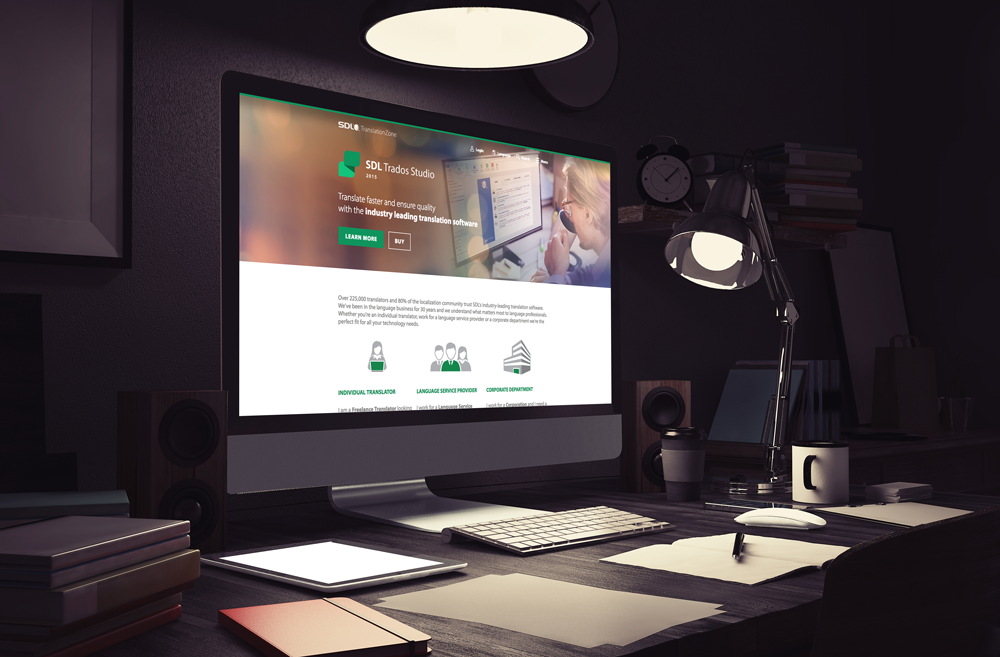
Not too long ago we launched a redesigned version of our translationzone.com site. The new design brings a more modern and fresh look and is the result of customer research conducted over the last year. It also features a totally redesigned SDL AppStore, the new home for all Translation Productivity Apps as well as our developer hub. The SDL AppStore replaces the previous SDL OpenExchange site.
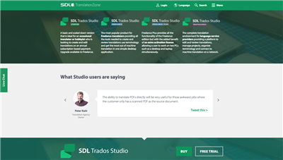
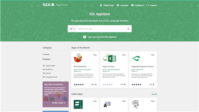
So now we are pretty curious in the UX design team, what do you think about it? you like it?
We would love to get a quick rating from you below as well would love to hear your feedback or suggestions!
Thanks a lot from the SDL UX Team!